
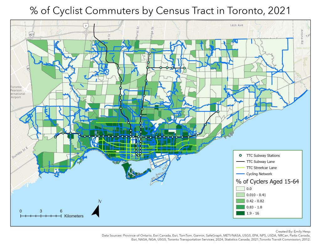
This map shows that high percentages of cyclists reside in the downtown core and are particularly salient along the three major roads from which the provincial government, under Bill 212, has proposed removing bike lanes. Government officials cited low percentages of bike trips (3-4%) and road congestion as two primary reasons for introducing the new legislation. One stipulation in the bill calls for the removal of the bike lanes on Bloor Street, Yonge Street and University Avenue. However, a report produced for the Ministry of Transportation warned that the removal of these bike lanes could lead to 54% increase in collisions for all road users.
The decision made by the provincial government is not reflective of the needs of cyclists in Toronto. As shown in the map, higher percentages of cyclists (as evidenced by the darker shade of green) live in the downtown area, nearer to the major roads (i.e. Bloor Street, Yonge Street and University Avenue) that will have bike lanes removed. Bill 212 would negatively impact the high concentration of cyclists living in these areas, in addition to those who commute along these streets from other parts in the city, by unnecessarily exposing riders to an increased risk of accidents and injuries from motor vehicles.
When the provincial government speaks of the low percent of bike trips in Toronto, the spatial distribution of the people making those 3-4% trips is not taken into account. Removing bike lanes in high-use areas would make cycling downtown less accessible for cyclists who are concerned about their own safety on the road. This map of the downtown area visually evidences that the provincial government is removing bike lanes where they are needed most by commuters.
This map and the answers included in the PDF below were created for a class project. We were expected to submit our map and one or two paragraphs explaining the choices made in constructing the map.
Click download or the PDF file name below if you wish to read more about my rationale for the design choices!

Leave a comment